 Go Faster: The Graphic Design of Racing Cars by Sven Voelker is, on the face of it, a very cool book. When I saw the promotional video for it online, I got so excited that I went immediately to Amazon and ordered it! The book arrived this morning, and I thought I'd write a review. Voelker, a graphic designer, professor, and car enthusiast based in Berlin has clearly created a labor of love in this book. But after managing to read through the entire thing just during my dinner -there are just about 12 pages of body text in this 144 page volume- I began to feel more satisfied by my chinese food than by this book. The cover design is really neat and attractive, the layout is clean and beautiful. The printing quality is very good. From a purely aesthetic point of view, the book is gorgeous. As a designer, I often find most books written for the enthusiast to be thoroughly lacking in the layout and graphic design department. Sadly this book, while delightful eye candy, is lacking in the content department.
The first portion consists mainly of a very cursory historical background of car liveries, from their origins as national colors all the way to the beginnings of big tobacco sponsorship in the late 1960s. Any serious racing enthusiast will already know just about everything contained in this section. Most disappointing was that the author's selection of historic photographs, while visually interesting, are not presented chronologically, and don't really go far enough to illustrate his points. For example, he mentions but never depicts the 1968 Lotus 49B with iconic Gold Leaf tobacco sponsorship. This is a real omission, for it was the first car in Formula One to use a commercial livery, basically changing the sport forever. The first section could have benefitted enormously from more and deeper research into the history of the national colors and also a contrast between North American and European approaches to graphic design on cars, which were and still are quite divergent. For example, cars at Indy had sponsor logos on them going all the way back to the 1920s, for example. This is not discussed in the book. A mention of NASCAR would also have been appropriate, given the fact that the principal difference between the cars is the paint scheme. The book, being German, focuses mainly on Porsche racing cars, and it made me wish that the author had simply chosen to focus exclusively on the history of Porsche graphics. Perhaps his scope was way too broad to start with, and the topic of Porsche 917 graphics alone is enough to fill a good book!
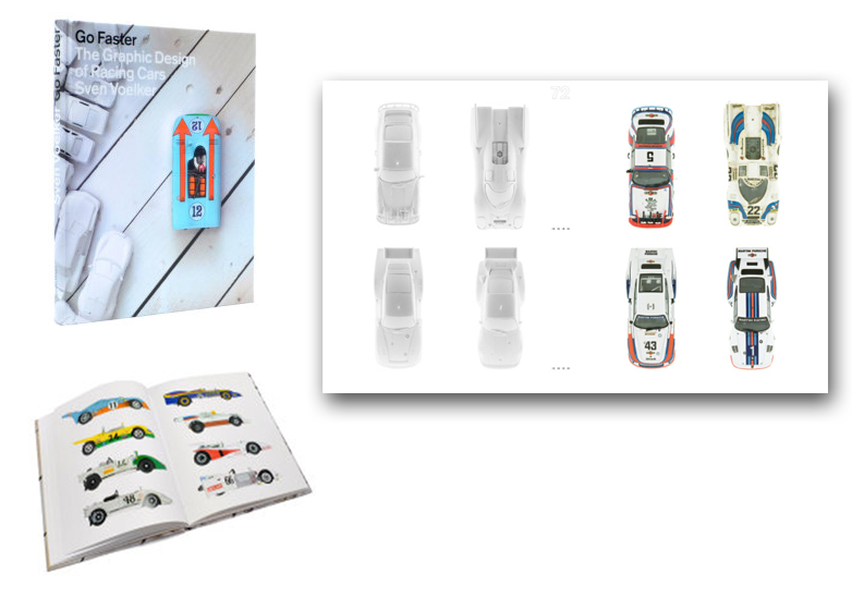
The second section of the book is purely pictorial. Voelker wanted to show off the cars' liveries from above and from the side, as well as contrast the painted cars with blank white examples of the same forms. He is chiefly interested in how the two-dimensional shapes warp and distort when applied to three-dimensional form. Instead of jetting around the world to photograph all the actual cars, which would have been incredibly costly, time consuming and just plain difficult, he cleverly uses model cars as stand-ins for the real thing. The idea is novel, and I love the poetry of having the blank white car next to the painted version for comparison. However, the models he chose were from his own collection, and most of them were cheap vintage diecasts rather than accurate scale models that really convey the beauty of the real cars. So the resulting page layouts are somewhere between an automotive butterfly collection and a value guide for dinky toys or hot wheels. Many of the models suffer from flaking decals and cracked plastic windows. All this distracts from contemplating the paint schemes and the shape of the actual car. I really wish he could have used higher quality models for his photos. A few of his pages have recent Minichamps models that are reasonably realistic, and these pages are by far the most effective. By the end, I concluded that the chosen method of using model cars was lazier than it was clever --not to mention that he ended up painting his whole model collection white in the end!
The difficult but effective way of making this book would be to create renderings of the cars from the top views, or even line drawings in color. This way you could really enjoy the graphic design, and the author could easily show multiple versions of the same car with little effort. If you think this is unrealistic to expect from a book, just check out any good book on WW2 aircraft. In some of these books you will find page and page after page of meticulous airbrush renderings of fighter planes showing every possible marking configuration from every squadron. It's been done many times, and the resulting books are both informative and beautiful. But Voelker's book seems like a shortcut in comparison. In the introduction the author bemoans the fact that such a dearth of published material exists on the topic of racing car graphic design, but in the end, he has produced a colorful coffee table book contributing no real new scholarship to fill the void he has pointed out. I am still glad I bought it, but the book really fails to live up the the hopes I had of learning more about the subject.
You can order your own copy here and let me know if you agree!


 F1,
F1,