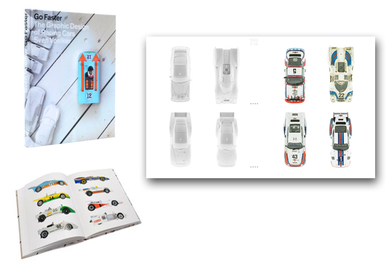
Holiday Book Review: Alpine & Renault: The Sports Prototypes Volume 1 1963-1969
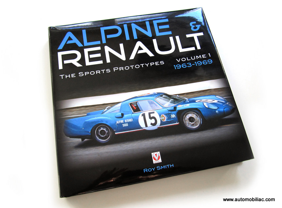
Finally, the fascinating story of Alpine-Renault’s heroic, yet quixotic efforts to win Le Mans outright for France are properly told in richly illustrated detail. In Veloce Publishing’s recent release Alpine & Renault: the Sports Prototypes, Vol. 1963-1969 by Roy Smith, we are taken through the history of the Alpine marque, from its humble beginnings as a preparer of Renault 4CV racers, through to the brink of its eventual incorporation into Renault in the 1970s (this is covered in Vol. 2).
Alpine is most closely associated with the immortal A110 Berlinette, which had a highly successful career in Rally, but the A110 is barely mentioned in this book. Instead, the focus is entirely upon Alpine’s long term Sports Prototype program which is less well-known outside of France. Though they rarely challenged for outright victory against the larger GT40s and Ferraris of their day, Alpine's Sports Prototypes were astonishingly effective and reliable in the smaller displacement classes, racking up many victories that have faded from the public memory. On a good day, these tiny blue cars could compete on equal footing at the Nurburgring with Ferrari’s best cars, not to mention the Porsche 550s and Abarths which were their main rivals.
 If the A110 is the French Porsche 911, then the Alpine Prototypes were more like Lotuses, in that they were aerodynamic and feather-light to compensate for being underpowered, and bristling with chassis innovation on a shoestring budget. Alpine’s sports car program also saw the very first racing slicks (!), co-developed with Michelin, and launched the racing careers of Patrick Depailler, Bob Wollek, and Emerson Fittipaldi. In particular, unsung Alpine hero driver Mauro Bianchi (brother of F1 driver Lucien) is given his proper due as a central character in this narrative.
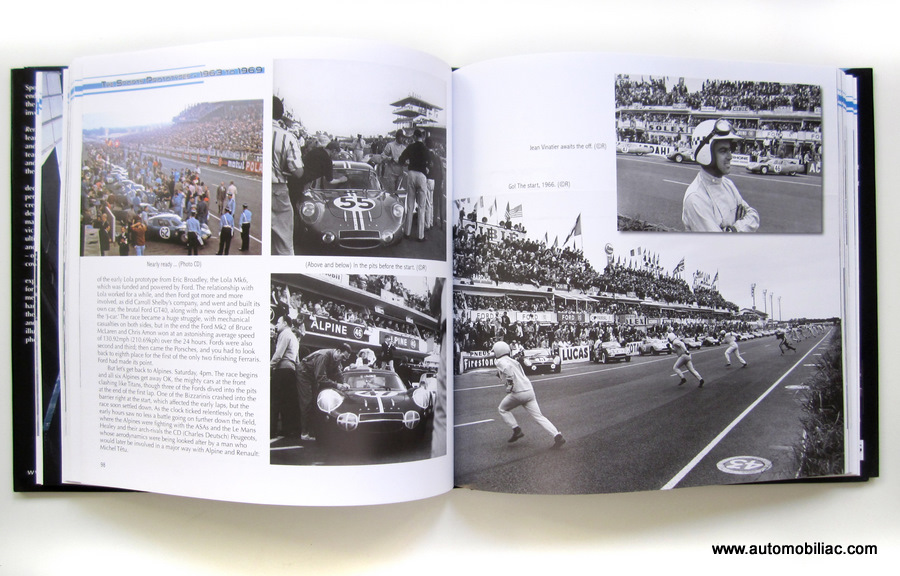 Rather than describe the story in dry prose, Roy Smith makes you feel almost like you have sat down to a long French déjeuner, fueled by a nice Bordeaux, with all the protagonists who are still alive today. There are many charming and hilarious anecdotes that really flesh out what life was like in the racing world of the 1960s. Unburdened by the passage of time, the drivers and engineers interviewed hold forth on the best and worst of what they experienced during those exciting years, and are honest about the frustrations they faced and the politics they dealt with. But the overall picture that one comes away with about the Alpine team is that it was like a big family, with Jean Rédélé, owner of Alpine, as the father, engine builder Amédée Gordini the stern grandpapa, and the drivers and engineers playing the dutiful yet mischievous sons, who had to work together to develop the cars and campaign them.
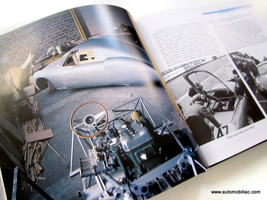
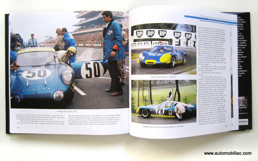 The book itself is extremely well executed, with pleasing graphic layout and a wealth of fascinating archival photos and drawings in B&W and Color. You can get lost for hours in all the photographs, as you track the gradual changes to each car, from race to race. The printing quality and paper are also very good.
Definitely a great gift for the true car geek who likes comprehensive and well-illustrated books!
Buy it at Amazon or at Motorbooks
 Bradley Price